These Maps Make Us Look At The U.S. In A Whole New Light

Fancy a cartload of cartography? Then join us to discover 40 magnificent maps that tell you a whole lot you don’t know about the U.S. There’s a wry view from a Brit and a map that tells you where all the Waffle Houses are. We even have an indispensable one that shows the places where single men outnumber single women! Some are weird, some are wacky, but all of them will make you look at the U.S. in a new light.
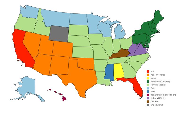
1. What a British guy calls “yee-haw states”
When it appeared on Reddit in 2020, this map was captioned, “How I, a Brit, see the United States (sorry if it offends anyone).” Certainly, it may not go down well if you’re thin-skinned! The orange states are all classed as “Yee-haw.” Even worse, the pale green ones are dismissed as “nothing special,” and the dark green ones are “small and confusing.” Gotta love that British humor...
2. The blue states have fewer people than LA County
Here’s an original way to look at population distribution in the U.S. What this map does is highlight all the states where fewer people live than in the whole of Los Angeles County. And as you can see, that’s plenty of states. A lot of folks trying their luck in Hollywood, maybe?

3. The most popular surnames by state
Now, here’s some truly indispensable information: the most common surnames by state. According to U.S. Census Bureau figures from 2010, California has a lot of Garcias. Johnsons overwhelm all-comers in the north, while Martinez is favored in New Mexico. Overall, though, Smith is top by a wide margin. Amazingly, the census recorded more than 2.4 million Smiths in the U.S.

4. The counties with a sky-high GDP
This map picks out the U.S. counties with an annual GDP of more than $100 billion. Basically, that’s the value of what’s produced there. And if you’ve got more than $100 billion of economic activity going on in your county, chances are you’re living the high life — or have neighbors who do.

5. Rivers and watersheds in beautiful technicolor
What you’re looking at here is a representation of all the rivers, streams, and watersheds in America. Each watershed — the area of a river system — is shown in a different color. And it certainly makes for an utterly ravishing image. It’s all down to the hard work of a Hungarian mapmaker called Robert Szucs.

6. Tree cover across the country
This map uploaded by a Reddit user depicts tree growth in the U.S., and it definitely shows the East Coast looking pretty green and leafy. But for wood-loving folks in the Midwest, there may be some good news. According to Global Forest Watch, the U.S. gained an extra 34 million acres of tree cover between 2001 and 2012.

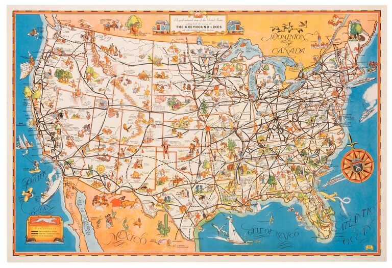
7. Those black lines are Greyhound bus routes
This is a blast from the past: a gorgeously illustrated map showing Greyhound bus routes in 1933. The black lines — which sometimes look rather like the meanderings of a drunken sailor — trace those journeys across America. And the drawings you see? They’re little representations of each region. We can’t help but notice the cowboy near Amarillo!
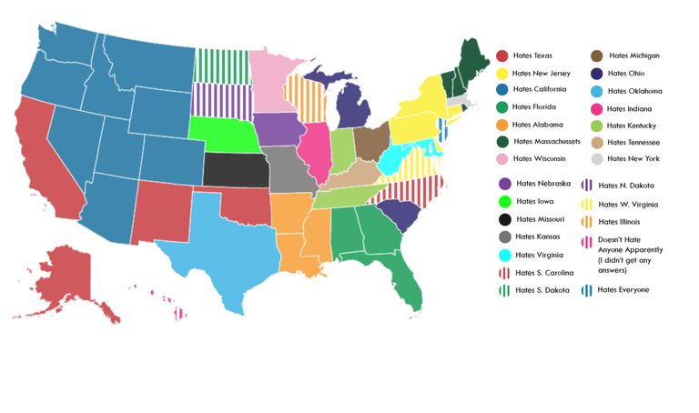
8. The states other states love to hate
This colorful collage says it shows every state’s least favorite state. It’s not the most scientific survey, coming as it does from Matt Shirley’s 400,000 Instagram followers — so take it with a grain of salt! But there certainly seems to be an inordinate amount of hostility towards California. Californians, meanwhile, have little time for Texans, who in turn have got something against Oklahomans. It all seems to be a mess of resentments!
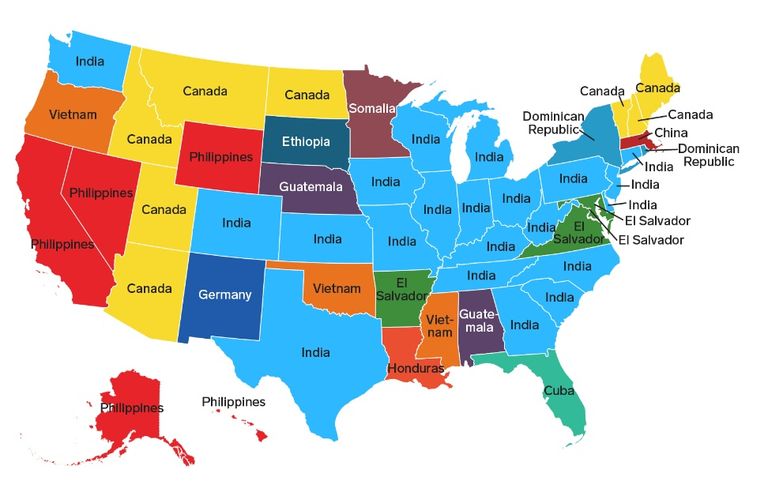
9. The countries foreign-born residents come from
This U.S. Census Bureau map tells us the countries of origin for foreign-born residents. There’s one important proviso, though: Mexicans are not included in the numbers. Perhaps the biggest surprise is the number of states where the most frequent country of birth is India. And why are there so many Germans in New Mexico, Ethiopians in South Dakota, and Somalians in Minnesota? Intriguing.
10. Where do most folks live?
Looking at the U.S. as a whole, where do most people live? That’s exactly the question this map addresses. Add up all those areas marked in red, and more people live in them than in all the gray areas put together. C’mon, folks in the red parts — Wisconsin’s pretty beautiful in the fall!

11. The bluer the area, the quieter it is
If you hold the belief that silence is golden, then you shouldn’t actually head to the gold parts on this map! Yep, the bluer somewhere is, the quieter it is. If you just can’t live without noise, though, then head for the coasts.

12. The lines are long-abandoned railroads
America was once a railroad nation, but that all stopped once cars came along. And this map from Reddit shows just how many rail routes have been lost over the years. It’s truly astonishing to see it all laid out so starkly.

13. Where do people say “dang”?
So demure it can hardly be classed as a cuss word, “dang” is said every day by folks in the U.S. Well, that’s more the case in the south... In the bluer regions of the map, you may have to wait for weeks or even months to hear it drop from anyone’s lips!

14. What uses the most land?
What do Americans do with their 3.8 million square miles? Give it over to cattle, according to this map! There’s a lot of timberland as well. What seems to be scarce is urban sprawl. In fact, according to the World Economic Forum, the U.S. has just over 63,000 square miles of urbanization. That’s only 2 percent of the total landmass.

15. The most coffee stores by brand
Ever been in a city with Starbucks on every corner? Well, you were probably somewhere in the green area of this map. When it comes to the number of stores in the U.S., Starbucks is the Genghis Khan of coffee shops, conquering almost all in its path. Dunkin’ Donuts puts in a creditable appearance, too, while Caribou and Tim Hortons bring up the rear.

16. The darker the state, the colder it gets
If you don’t like chilly weather, now you know where to avoid — at least in winter. The darker the state, the lower the temperature tends to drop. And note Alaska: it can get colder than the coldest thing you can think of.

17. Light pollution across the nation
Enjoy stargazing? Well, there are still large parts of the U.S. where you can find true darkness. You may just have to get off the beaten track. And avoid the brightly colored areas on this map, as they’re the ones in the U.S. with the most light pollution.

18. The millions of miles of roads
Can there really be 8 million miles of roads in the U.S.? Actually, according to Statista, there are just over 4 million miles of highways, but this Reddit map also includes streets. The thickly woven grid only thins out across the Rocky Mountains and the Great Plains. It also shows a big difference between the East and West Coasts.

19. Garbage can or trash can?
It’s a fine distinction — but one that divides Americans. We’re talking about whether you say “trash can” or “garbage can,” of course! In the north, it’s all garbage; down south, however, you’ll hear trash talk. Just to confuse things: if you travel across the pond to Britain, you’ll need to learn a new term. It’s “rubbish bin” over there...

20. Where to get waffles
We’re not talking about just any old waffles. No, we specifically mean the ones served up by the venerable Waffle House franchise, which was founded back in 1955 by two Georgians called Joe Rogers Sr. and Tom Forcer. And in the years since, Waffle House has penetrated everywhere from Colorado to North Carolina — though there’s still plenty of room for expansion. Maybe those folks in Oregon would like to try an All-Star Special!

21. The color of state governors’ eyes
Here’s a map offering some trivia you didn’t know you needed: the color of every state governor’s eyes in 2018. Cunningly, the cartographer has colored the states with brown-eyed governors brown, while the blue-colored states represent… well, you can probably work it out. Intriguingly, just one state has, or had, a green-eyed governor: Virginia.

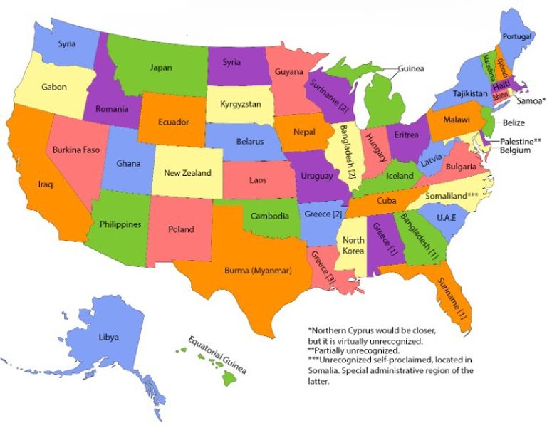
22. Fitting world nations into U.S. states
Those names don’t quite look right! Well, there’s a reason for that: those countries are said to have close to the same surface areas as the states they’ve usurped. Lucky Colorado gets to be New Zealand. California is perhaps less fortunate to be Iraq. And three states — Louisiana, Arkansas, and Alabama — all have the honor of being Greece. But the booby prize probably goes to Mississippi. Its new identity is North Korea...
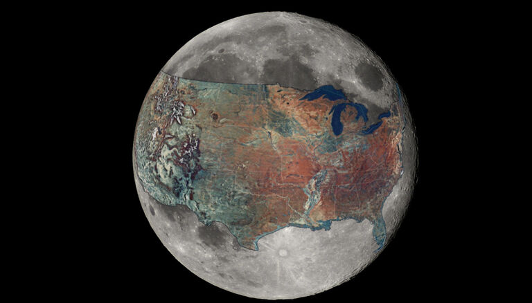
23. The U.S. moved to the Moon
Ever thought America may be better off if it left the Earth? Perhaps not. Though supposing you did, how about moving the USA lock, stock, and barrel to the Moon? After all, America’s the only nation ever to put humans on its surface. Before you make up your mind, take a look at this map from Reddit to get an idea of how things would look.
24. Where top brands come from
Ever wondered exactly where Dr. Pepper originally comes from? What about FedEx? Well, if those questions have been keeping you up at night, then this handy map provides the answers. It’s no surprise that Louisiana originated Tabasco. But did you know that Taco John’s started in Wyoming? That’s a long way from Mexico!

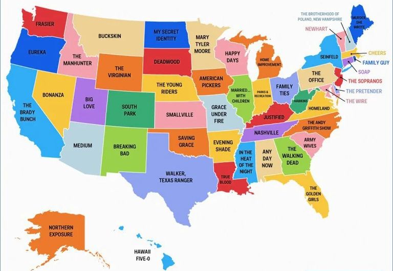
25. Where our favorite TV shows are set
Okay, so the setting of Hawaii Five-O is pretty self-explanatory. And if you’re a Frasier fan, you’ll know Dr. Crane and his family live in Seattle, Washington. Georgia, on the other hand, is where you can find The Walking Dead. Make of that what you will...
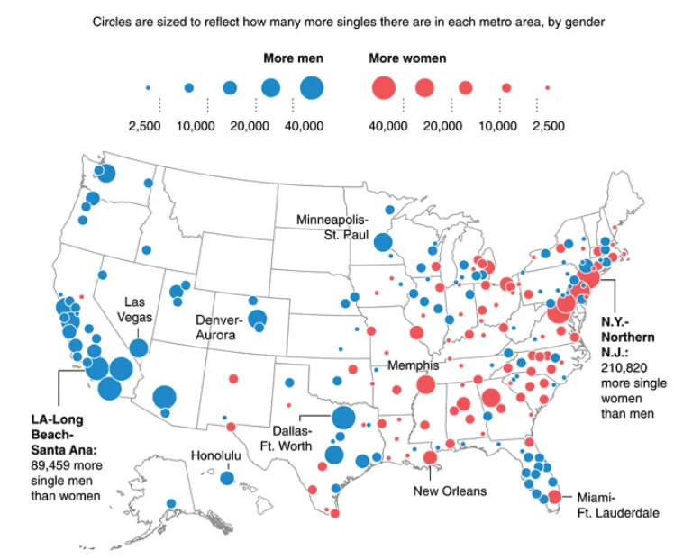
26. Where to find the singletons
This map from Reddit is great for anyone who’s desperately seeking love, as it shows those areas with the highest — and lowest — numbers of singletons by gender. If you’re a heterosexual man looking for romance, you’d be well-advised to head for Georgia or the northeast coast. Straight women are most likely to find mates in California or Texas. And if you’re gay, just reverse that geographical advice.
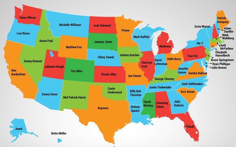
27. The best-loved celebrities from each state
Is it any surprise that our favorite celebrity from Minnesota is Prince? Or that it’s Beyoncé for Texas? Nope! But while California also has a big crop of homegrown heroes, the most-loved celeb from the Golden State is apparently... Kim Kardashian. We want to see those poll results...
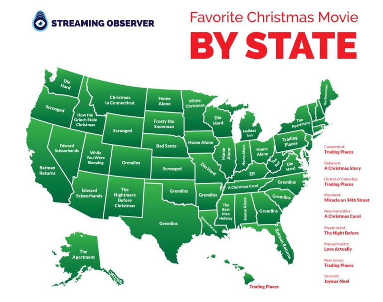
28. The most popular Christmas movies in each state
Christmas is a time for family. More specifically, it’s a time to overeat and then slump in front of the TV to watch your favorite holiday movie with your family. And it seems each state has its own favorite festive flick — as determined by search hits. Gremlins scores highest, with six states to its name. But how Christmassy is that movie, we ask? You could say the same about Die Hard, which is seemingly beloved by folks in Washington, Wisconsin, and Missouri.
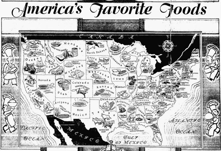
29. What we loved to eat in 1933
Let’s hop into a time machine and head to 1933. Our mission? To find out what folks liked to eat back then. Actually, this invaluable map means we don’t need to travel through time — although we’re questioning some of the information here. Arkansans apparently liked nothing more than frogs’ legs — sounds a bit French! — while Nevadans craved something called carrot pudding. And Pennsylvanians apparently had a grudge against turtles, as they liked to chow down on snapper soup.
30. The nighttime light across the U.S.
This Getty Images shot shows just how well illuminated the U.S. is at night. Obviously, the brightest parts show where the population numbers are highest. And, of course, we have Thomas Edison to thank for all this artificial light. Although he didn’t invent the first electric lightbulb — that came from Humphry Davy in 1802 — he did refine the concept and bring it to the mass market.

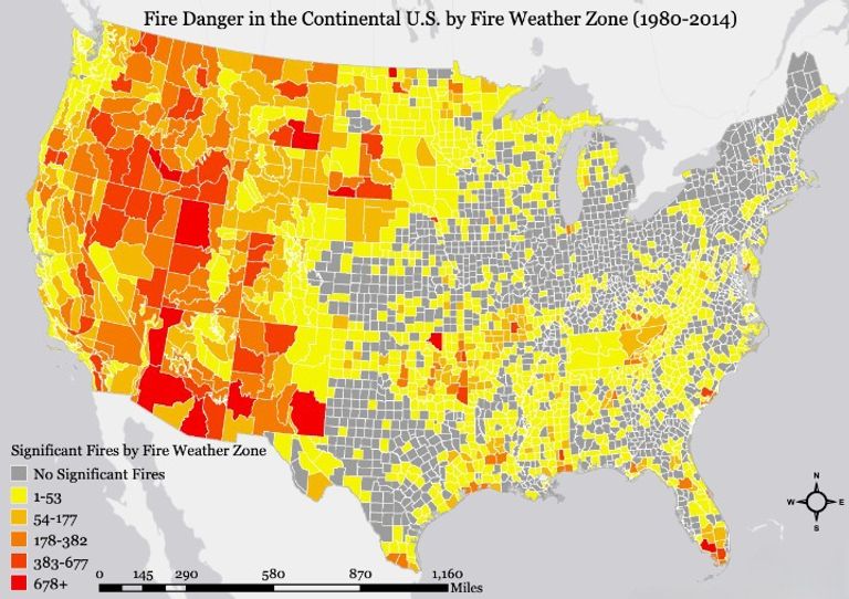
31. The number of significant wildfires in each state
Wildfires have been in the news a lot in recent years, and often they’ve had tragic consequences. This map, using data from the United States Geological Survey, gives us a clear view of the places where the most uncontrolled fires break out. And as it’s plain to see, the further west you go — basically, the areas where there’s lots of red and orange — the higher the risk of large blazes.
32. Where U.S. presidents were born
You can rank U.S. presidents in any number of ways, but this map simply shows us how many were born in each state. There’s an apparent bias towards the northeast, too. According to this map, Virginia has produced eight presidents, Ohio seven, and New York five. And all those states colored gray? There’s not a single president between them!

33. Population numbers in lines
The bright columns rising skywards on this map depict population numbers. The higher the line goes, the more people live in the area it shoots up from. We’re looking at the U.S. from the east, and it’s on the Eastern Seaboard that the population is strikingly the highest. Other tallish columns are dotted around before another cluster of high lines appears on the West Coast.

34. How much snow is needed for a school snow day
Remember eagerly awaiting the name of your school during snow day announcements? Your mom and dad were probably a little less enthusiastic about classes being canceled... And if you’re a parent yourself now, you may want to consult this very useful map, which shows the amount of snow required in each area to shut the schools. The bluer the map is, the more snow needs to fall before education comes to a temporary halt.

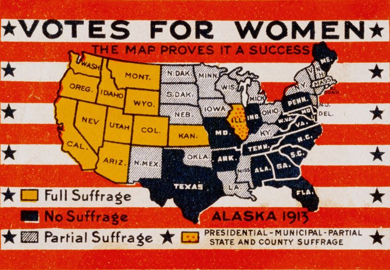
35. Where women could vote in 1913
This map was actually published in the form of a postage stamp in 1913, although you couldn’t have used it to mail a letter. Instead, it was a campaigning tool in the battle for voting rights for women. The position in every state is shown, and it’s clear that there was still a long way to go in the struggle for female suffrage. In fact, it was only in 1920 when women finally won the argument and the right to vote across the U.S.
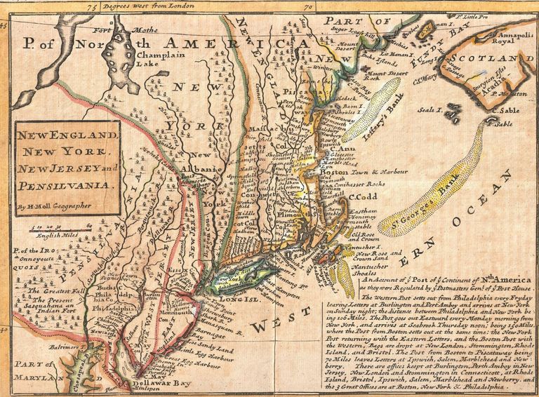
36. The nation in 1729
This intriguing vintage item dates back to 1729. It’s commonly known as the Post Map and was created by Herman Moll — one of the foremost mapmakers of his era. Of course, when Moll drew it up, the territory he depicted was still an English colony. Nearly half a century would pass before the Founding Fathers finally published the Declaration of Independence.
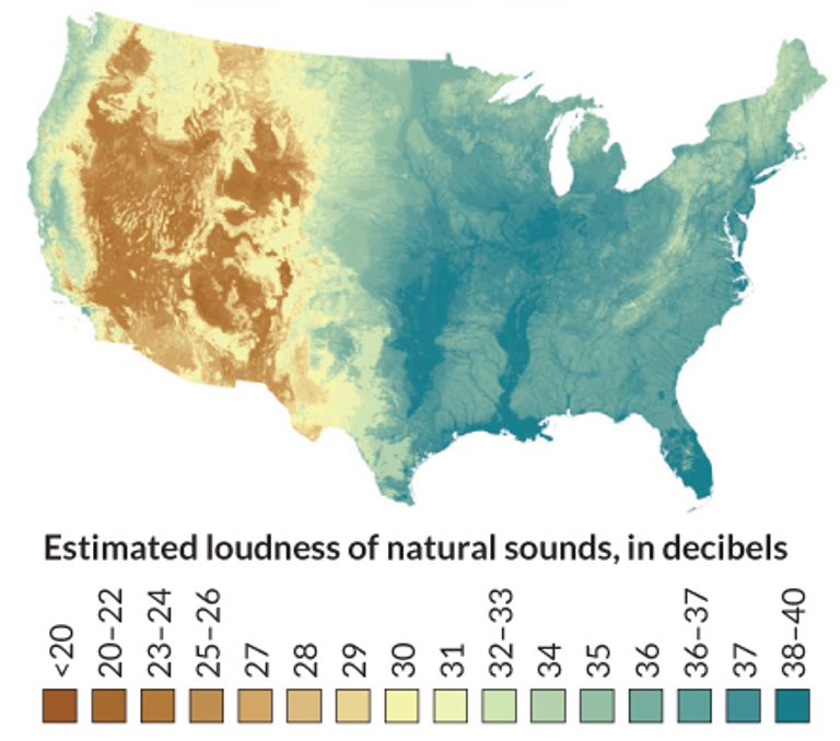
37. The greener the area, the louder the nature
This fascinating map shows what America would sound like if there were no people living there. It estimates in decibels the volume of noise that nature alone would produce. The browner areas — centered on the Rocky Mountains — are quieter, while the natural world is at its loudest in the greener parts. We can only assume that the louder the noise, the more abundant the wildlife.
38. The states with their own official dinosaurs and fossils
You know that states have their own official birds, flowers, and other emblems, but we bet you didn’t realize that some have their own dinosaurs and fossils! And thanks to this map, you know exactly what goes where. The dark green states have both official fossils and dinosaurs, while the pale green ones have fossils only. And the states in orange? Poor Minnesota, Iowa, Indiana, New Hampshire, and Rhode Island have neither!

39. The nation’s empty bits
If you crave solitude, this is the map for you. Using census data, it shows the parts of America that have the fewest people. If you’re hankering for the lonely life of a hermit, head for the most densely green areas to get away from it all. The whiter parts, which have the highest populations, will not suit you at all.

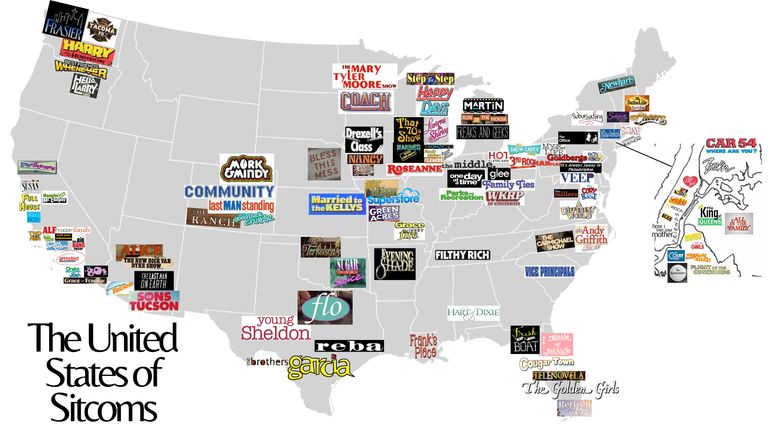
40. The United States of sitcoms
Some regions do rather well when it comes to settings for sitcoms. The West Coast is packed with funny shows, as is the East Coast. Colorado and Texas also look pretty popular. But all too many states have not a single sitcom to their names. Come on now, producers — you could get some yuks out of a cowboy show in Montana!
_-_Geographicus_-_NewEnglandNewYork-moll-1729.jpg)